The Dynamic Grid Component displays data in a tabular format from a Workspace Assembly-driven data source. Each column represents a field, and each row represents a record. This grid enables you to read data from various sources, transform that data, and write it back to the grid (or leverage the workspace assembly to direct data to another target if needed). This offers a flexible and high-performance feature for managing large datasets. It supports paging, dynamic columns, custom formatting, and other customizations. This component maintains the core functionality of the SQL Table Editor Component while enhancing the flexibility of data presentation and end-user interaction.
The key features of the Dynamic Grid Component include the following benefits:
-
Flexible data transformation: Read, write, and transform data from various sources using Workspace Assemblies.
-
High performance: Manage large datasets efficiently with paging.
-
Dynamic columns: Add, remove, and customize columns.
-
Custom formatting: Apply custom formatting to data for better visualization.
This component is created in the Windows Application and can be displayed in the Modern Browser Experience and the Windows Application.
To use the Dynamic Grid Component, follow these steps:
Review the Prerequisites
Before you create a Dynamic Grid, review these developer and setting prerequisites.
Developer
-
Primarily, the Dynamic Grid will be created by a developer. Users will interact with the grid.
-
The developer should have in-depth knowledge of OneStream Workspace Assemblies, source data, and target data.
Settings
-
Create a Workspace and Maintenance Unit. See Workspaces Setup.
-
Create a Dashboard Group and Dashboard. See Dashboards.
Create a Dynamic Grid Component
-
Go to Application > Presentation > Workspaces.
-
Click the arrow to the left of the Workspace to expand the navigation tree.
-
Click the arrow to the left of the Maintenance Unit to expand the navigation tree.
NOTE: Do not select the Default Maintenance Unit if you have also selected the Default Workspace because you will not be able to add a Dashboard Component.
-
Click Components.
-
In the toolbar, click the Create Dashboard Component button.
-
In the Create Dashboard Component dialog box, select Dynamic Grid and then click the OK button.
-
Name the Dynamic Grid.
NOTE: The Dynamic Grid name must be unique within its Workspace.
-
Update the configuration settings. See Update Configuration Settings.
-
Click the Save button.
Update Configuration Settings
Configure the available settings for the Dynamic Grid Component.
| Property | Description |
|---|---|
| General (Component) | |
| Name | Enter a name for the Dynamic Grid Component. The name must be unique within its Workspace. |
| Description | Enter a description for the Dynamic Grid Component. The description will display as the title text in the title header row. |
| Formatting | |
| Display Format |
Click the ellipsis button to select an option for how the colors display in the background.
Display Format settings in the Assembly code will override the option selected in this property. |
| Processing | |
| Template Parameter Values | Enter a comma-separated list of name-value pairs to specify Template Parameter Values. These values are used as the default settings for Template Parameters referenced using the ~!tParam!~ syntax related to Dynamic Workspace processing (for example, “tParam1=Value1, tParam2=Value2”). |
| Text 1 | Enter arbitrary text that can be accessed by Business Rules or Dynamic Workspace processing. For example, this property can be used to specify a parameter name or a functional name as a hint when implementing Selection Changed actions. See User Interface Action and Navigation Action in Component Formatting and Action Properties. It also supports template variables (for example, ~!tParam!~) for Dynamic Workspace processing. |
| Text 2 | Enter arbitrary text that can be accessed by Business Rules or Dynamic Workspace processing. For example, this property can be used to specify a parameter name or a functional name as a hint when implementing Selection Changed actions. See User Interface Action and Navigation Action in Component Formatting and Action Properties. It also supports template variables (for example, ~!tParam1!~) for Dynamic Workspace processing. |
| Action | |
| Dynamic Grid | |
| Filter Mode |
Configure to filter data from column headings using options Popup and Filter Row.
This setting is the same as the Filter Mode setting for the SQL Table Editor Component. See SQL Table Editor Filtering. |
| Default For Columns Are Visible |
Select True to display all columns in the grid (unless overridden at the individual column level). Select False to hide all columns in the grid (unless overridden at the individual column level). |
| Show Title Header |
Configure to show (True) or hide (False) the title header row at the top of the grid. NOTE: If set to False, the Default For Allow Column Updates, Process Selection Changed For Inserts, Allow Inserts, and Allow Deletes options remain enabled. |
| Default For Allow Column Updates |
Select True to allow the data in the existing table to be updated. Select False to turn off this option. |
| Show Title | Configure to show (True) or hide (False) the title text in the title header row. |
| Show Column Settings Button | Configure to show (True) or hide (False) the Column Settings button, which enables users to reorder the columns and set the column visibility. |
| Show Deselect All Button | Configure to show (True) or hide (False) the Deselect All button, which enables users to clear the checkboxes for all selected rows. |
| Process Selection Changed For Inserts |
Select True, and set the Allow Inserts option to True to allow the Insert button to process the selection changed event, which is often configured to refresh a portion of the dashboard. Select False to turn off this option. |
| Allow Inserts |
Select True to allow rows of data to be added to the table. Select False to turn off this option. |
| Allow Deletes |
Select True to allow rows of data to be deleted from the table. Select False to turn off this option. |
| Retain Table Column Order |
Select True to allow the column order to be changed using the Assembly service. Select False to turn off this option. |
| Read Only Text Color | Select (Use Default) to set the default text color to standard black text. Update to use any text color, including a system color (for example, XFReadOnlyText). |
| Column Name for Bound Parameter | Enter the name of the column to use to change the value of the bound parameter when a database row is selected. This is used when a Dynamic Grid is being used to affect the display of other Dashboard Components (for example, when showing detailed information for the selected row). |
| Default For Show Search |
Select True to enable search functionality within the drop-down menu for all columns that are bound to a list parameter, unless specified otherwise for individual columns. This setting is the same as the Default For Show Search setting for the SQL Table Editor Component. See SQL Table Editor Searchable Drop-Down List. Select False to turn off this option. |
| Allow Multiselect |
Select True to allow checkboxes to be selected for multiple rows. The active selected items will be passed to the defined Bound Parameter field as a comma-delimited list. The Bound Parameter format will be: Item1, Item2, Item3. If three values, A, B, C,D, are selected (where C,D is one value), the resulting Bound Parameter string is: A, B, "C,D". This setting is the same as the Allow Multiselect setting for the SQL Table Editor Component. See SQL Table Editor Multiselect. Select False to turn off this option and only pass a single Bound Parameter at a time. The checkboxes will not display in the user interface. IMPORTANT: To use multiselect in the Dynamic Grid, ensure the XFDataTable returned from the Dynamic Grid Service has at least one primary key column. Especially when retrieving data from multiple sources, ensure each primary key column is set. See Dynamic Grid Service. |
| Rows Per Page | Enter a numeric value between 1 and 3000 to specify the number of rows to display before a page break. The default is -1, which turns off the property and uses your defined user preference property Grid Rows Per Page, which is located in the Security settings on the user profile. If you enter a value greater than 3000, the maximum number of results per page is still 3000. |
| Save State Settings | |
| Save State |
Select True to retain the user settings on the component. User preferences for columns saved will be for Order, Visibility, Filtering, Freeze Bar, Sorting, and Widths. This setting is the same as the Save State setting for the SQL Table Editor Component. See SQL Table Editor Save State User Preferences. Select False to turn off this option. NOTE: To reset the Save State to default, right-click on the dashboard to enable the Reset State to return to its Component Properties settings. |
| Vary Save State By |
Select True to save the Save State settings by Workflow Profile and Workflow Scenario. The related Dashboard Component will have the option Reset All States, which can be used to clear the Save States for a user across all the Vary Save State By parameters. Select False or (Use Default) to turn off this option. |
| Data Manipulation Buttons | |
| Show Data Manipulation Buttons | Configure to show (True) or hide (False) the Add Row, Remove Row, Cancel, and Save buttons. |
| Show Add Row Button | Configure to show (True) or hide (False) the Add Row button. |
| Show Remove Row Button | Configure to show (True) or hide (False) the Remove Row button. |
| Show Cancel Button | Configure to show (True) or hide (False) the Cancel button. |
| Show Save Button |
Configure to show (True) or hide (False) the Save button. |
Add the Dynamic Grid Component to a Dashboard
-
In the same Maintenance Unit as the Dynamic Grid Component, click the arrow to the left of Dashboard Groups to expand the navigation tree.
-
Select a dashboard.
-
Click the Dashboard Components tab.
-
In the toolbar, click the Add Dashboard Component button.
-
In the Add Dashboard Component dialog box, select the Dynamic Grid Component and then click the OK button.
-
Click the Save button.
Create a Workspace Assembly Dynamic Grid Service
-
In the same Maintenance Unit as the Dynamic Grid Component, click Assemblies.
-
In the toolbar, click the Create Assembly button.
-
On the Assembly Properties tab, in the Name field, name the Assembly.
NOTE: The Assembly name must be unique within its Workspace.
-
In the Compiler Language drop-down menu, select a language.
-
In the toolbar, click the Save button.
-
Create files for the Service Factory and the Dynamic Grid Service.
-
On the Assemblies Files tab, right-click on Files and select Add File. In the Add File dialog box:
-
In the File Name field, enter a name for the file (for example, ServiceFactory).
-
In the Source Code Type drop-down menu, select Service Factory.
-
In the Compiler Action drop-down menu, select (Use Default).
-
Click the OK button.

-
-
On the Assemblies Files tab, right-click on Files and select Add File. In the Add File dialog box:
-
In the File Name field, enter a name for the file (for example, DynamicGridService).
-
In the Source Code Type drop-down menu, select Dynamic Grid Service.
-
In the Compiler Action drop-down menu, select (Use Default).
-
Click the OK button.

-
-
-
By default, Dynamic Grid methods for Get and Save are included. See Dynamic Grid Service. Modify the code as needed.
-
To enable the Dynamic Grid, in the Service Factory Assembly File, highlight the lines for the Dynamic Grid, and click the Uncomment the selected lines. button.

NOTE: Ensure the object name matches the name of the Dynamic Grid Service file.

-
In the toolbar, click the Save button.
-
Select the Maintenance Unit. In the Workspace Assembly Service field, enter the name of the Assembly and the Service Factory Assembly File in this format: <Assemblyname>.<ServiceFactoryAssemblyFilename>
Example: If the Assembly name is DynamicGridService and the Service Factory Assembly File name is ServiceFactory, the Workspace Assembly Service would be: DynamicGridService.ServiceFactory

-
In the toolbar, click the Save button.
-
Select the Assembly, and click the Compile Assembly to check syntax button to ensure the Workspace Assembly files compile.
Row and Cell Formatting
Designers can set the column, row, and cell formatting of a Dynamic Grid through the workspace assembly to enhance the visual presentation of data. Cell formatting takes precedence over row formatting and row formatting takes precedence over column formatting. Also, grid settings and properties defined in the workspace assembly will take precedence over settings defined in the component property grid.
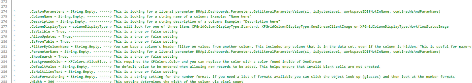
The following grid formatting properties are available for use in the workspace assembly. See below for an example of how to configure a column definition object using these properties.
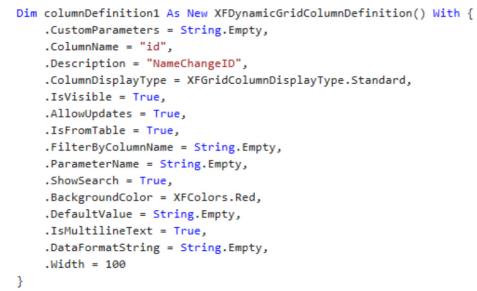
The following image provides an example of row and cell formatting in the workspace assembly and details are provided below.

-
Create an XFDataRow object with a row, using its specific row number.
-
Create an XFDynamicGridRowFormat object.
-
Enter display formatting options through code by specifying a value for a format property of the object.
-
Create a Guid and apply as a value to the following properties:
-
.RowID (XFDynamicGridRowFormat object)
-
UniqueIDForRowFormat (XFDataRow object)
-
-
Create an XFDynamicGridRowCellFormat object to format a specific cell or cells in the row. Cell formats can be added to the RowFormat object to be applied to specific cells based on column name.
Export the Dynamic Grid
Export data from the Dynamic Grid to create Excel files that can be used outside of OneStream. The display formatting configured for the Dynamic Grid will also apply to any exported data.
To export, follow the instructions:
-
In the Dynamic Grid toolbar, click the context menu button.
-
In the context menu, click Export.
-
In the Export to Excel dialog box, select a page range. You can select: CurrentPage, AllPages or Custom. If you select Custom, enter a page range of two number separated by a hyphen in the text field below.
-
(Optional) Select the Apply Current Filters checkbox to include matching rows based on the filters that are currently applied to data in the Dynamic Grid.
-
(Optional) Select the Apply Current Sorting checkbox to sort the exported data based on sorting currently applied to data in the Dynamic Grid.
-
Check the box next to the columns you want to export.
-
Click the OK button.


